Echoes of Elegance: The Art of Phonograph Product Brochure Design
In the realm of high-fidelity audio and vintage aesthetics, the phonograph stands as a timeless icon of craftsmanship and auditory pleasure. Designing a product brochure for such an item is not merely a task of listing specifications; it is an exercise in visual storytelling, where design must echo the product's soul. This brochure aims to be a tactile and visual symphony, harmonizing classic elegance with modern clarity to captivate the discerning collector and audiophile.
Cover & First Impressions: A Prelude to Luxury
The cover sets the stage. Imagine a deep, matte charcoal or rich walnut-textured paper. Centered, a stunning, high-resolution photograph of the phonograph's brass horn catches a soft light, its curves gleaming against a dark, muted background. The title, 'Echoes of Elegance', is embossed in a sleek, serif font (like Didot or Garamond), offering a tactile experience. This minimalistic approach speaks volumes, promising an experience of refined luxury before a single page is turned.
Interior Layout: Conducting the Visual Journey
The interior employs a clean, grid-based layout that ensures readability while allowing artistic flourishes. The core philosophy is 'breathing space'—ample margins and strategic negative space let the product and key messages resonate.
- The Heritage Spread: The brochure opens with a two-page spread. On the left, a short, powerful narrative in elegant type: 'Where History Meets Harmony.' On the right, a curated, sepia-toned photograph of a historic workshop or an iconic early recording session, subtly connecting the modern product to its legendary lineage.
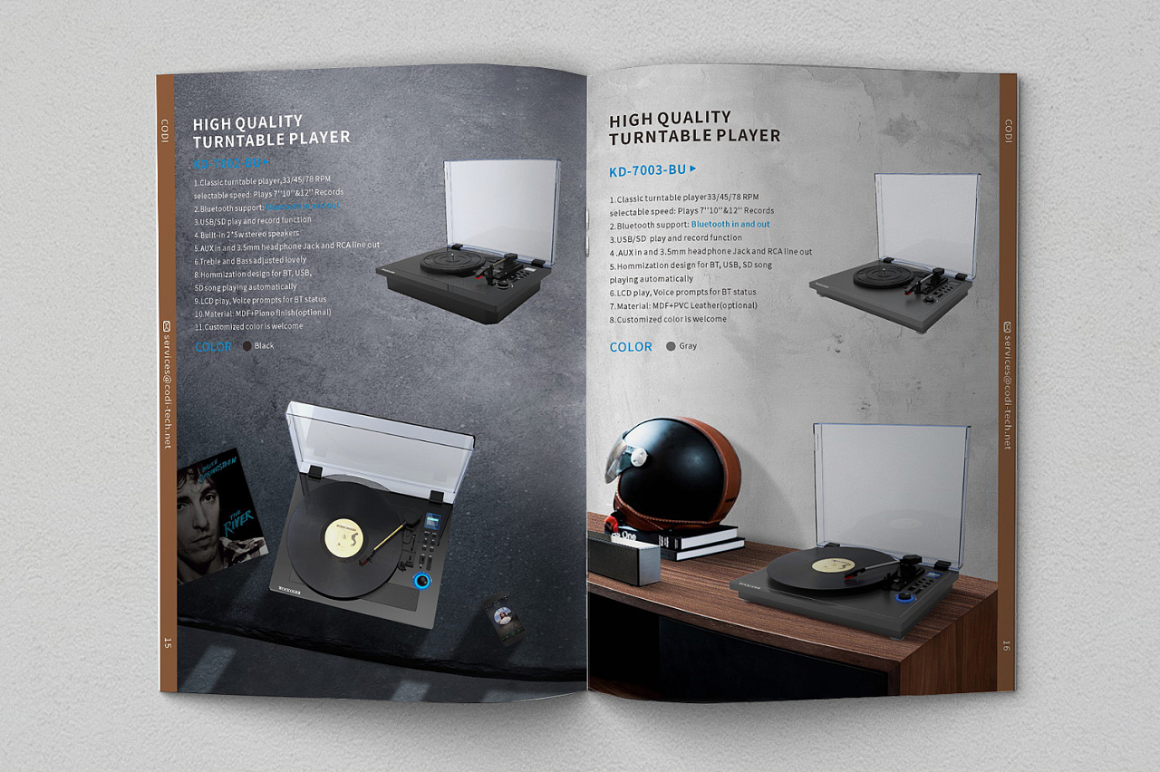
- The Product in Focus: Subsequent pages are dedicated to showcasing the phonograph itself. We use a mix of full-bleed dramatic shots and precise, isolated studio images. One page might feature the entire unit in a tasteful modern living room setting, demonstrating its aesthetic fit. The opposite page employs clean cut-out images highlighting exquisite details: the grain of the wooden cabinet, the intricate mechanism of the turntable, the hand-polished finish of the horn. Brief, impactful captions accompany these ('Crafted Resonance', 'Mechanical Poetry').
- Specifications with Style: Technical details are presented not as a dry list but as an integrated design element. A dedicated spread uses elegant typographic hierarchies. Key specs (e.g., 'Pure Oak Cabinet', 'Precision-Ground Steer Horn') are set in a larger, bold font, while finer details are in a lighter, smaller type. Icons and thin lines are used sparingly to organize information, ensuring it is accessible yet visually cohesive.
- The Sensory Experience: A crucial section uses evocative imagery and text to translate the auditory experience into visual form. Abstract backgrounds with wave-like textures or minimalist illustrations of sound waves flowing from the horn can be used. Quotes from renowned musicians or audio critics about the warmth and authenticity of vinyl sound are set in elegant script or italics, adding a layer of testimonial and emotion.
- Call to Action & Closure: The final spread is clean and direct. One side features a beautiful, simple shot of the phonograph with just the brand logo. The other provides clear, courteous contact information, website, and social media handles in a discreet footer. The tagline, 'Listen to the Legacy.', serves as a powerful closing note.
Typography & Color Palette: The Unseen Harmony
Typography is a key player. A combination of a refined serif for headings and body text (evoking tradition and authority) with a clean, geometric sans-serif for captions and technical data (implying precision and modernity) creates a dynamic yet balanced dialogue.
The color palette is deliberately restrained. It draws from the product's own materials: deep blacks, warm browns and tans (from wood), accents of brass or gold foil for highlights. Occasional use of a very dark green or navy can add depth and a touch of contemporary sophistication. This limited palette ensures the product remains the undisputed hero.
Conclusion: More Than a Brochure
This phonograph brochure design transcends mere promotion. It is a curated object itself, meant to be held, savored, and kept. Through intentional use of space, imagery, and typography, it doesn't just describe a device that plays records; it visually articulates the promise of an experience—one of history, craftsmanship, and unparalleled sonic beauty. In the hands of the prospective buyer, it becomes the first, perfect note in a lasting relationship with sound.
如若转载,请注明出处:http://www.lcfhba.com/product/74.html
更新时间:2026-06-19 09:47:02